
Short answer: A beautiful website and a website that generates leads are two different things. Good-looking sites go quiet when they’re missing the fundamentals that turn a visitor into a customer — a clear value proposition, an obvious next step, fast mobile performance, believable proof, and a form that actually reaches a real person who follows up. Design gets you the first few seconds. The rest is conversion.
If your site looks great but the phone isn’t ringing, this article is for you. Here are the real reasons — and what a working lead-generation website does differently.
The core misunderstanding
It’s easy to assume that if a site looks professional, it must be “working.” But looks and leads are separate jobs. A visitor doesn’t reward you for a nice design; they reward you for quickly understanding what you do, believing you can do it, and seeing an obvious way to take the next step.
Most sites that “don’t work” aren’t missing a fancier design. They’re leaking visitors at one of a handful of predictable points.
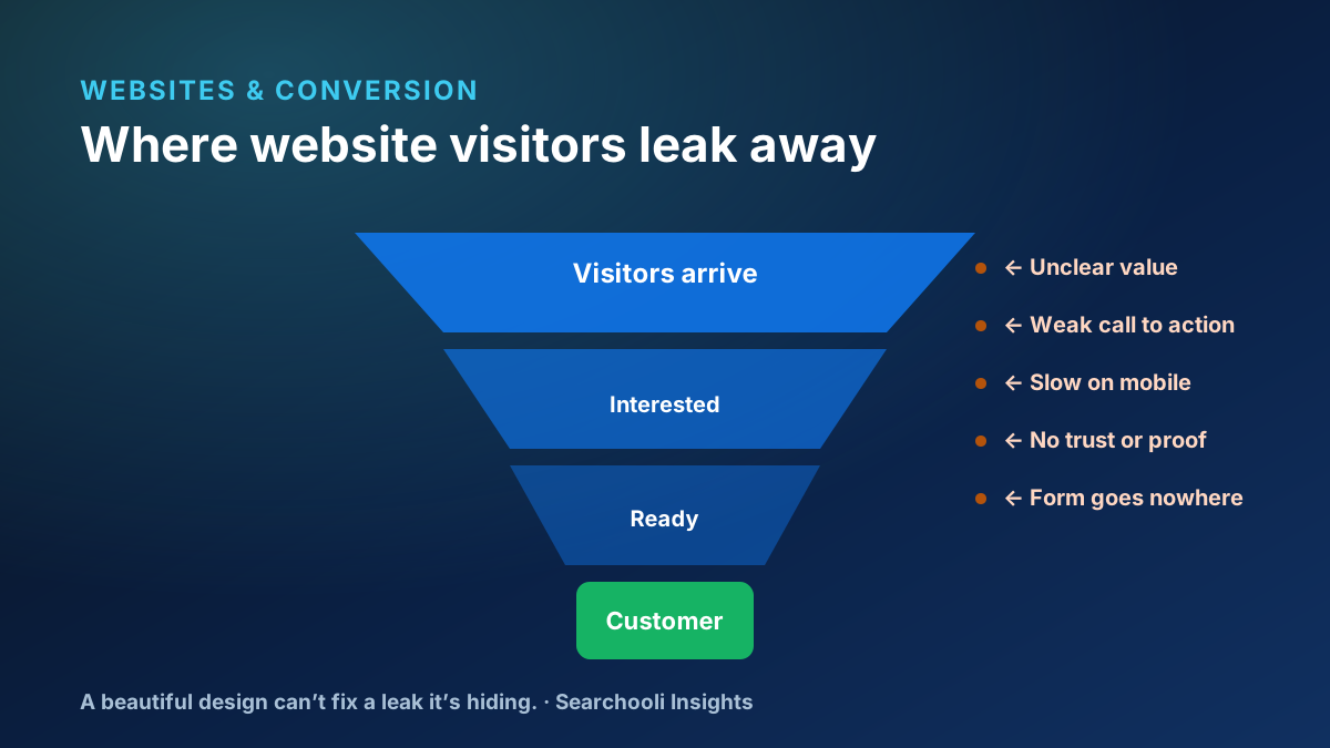
1. The value proposition is unclear
Within a few seconds, a visitor should know what you offer, who it’s for, and where they are. If your headline could belong to any business in your industry — “Quality you can trust” — it isn’t doing its job. Clarity beats cleverness every time.
2. The calls to action are weak or competing
If every section shouts a different action — call, book, download, subscribe, follow — the visitor freezes. A working page has one obvious primary action and makes it easy to take. Competing CTAs don’t add options; they add friction.
3. It’s slow or unstable on a phone
Most local searches happen on a phone, and a slow or shifting page loses people before they read a word. Google’s Core Web Vitals give concrete targets worth aiming for: Largest Contentful Paint under 2.5 seconds, Interaction to Next Paint under 200 milliseconds, and Cumulative Layout Shift under 0.1 (web.dev: Web Vitals). These are also part of Google’s page-experience signals (Google Search Central: Core Web Vitals) — but the real reason they matter is simpler: people leave slow pages.
4. There’s no trust or proof
People buy from businesses they trust. A site with no reviews, no real photos, no recognizable work, and vague claims gives a visitor no reason to believe you over the next option. Real, specific proof — and honest language — does more than any badge or stock photo.
5. It isn’t locally relevant
For a local business, a visitor is quietly asking “do they serve me, here?” Sites that never name their service area, never mention the towns they cover, and read like they could be anywhere leave that question unanswered. Local specificity reassures customers — and it reinforces your local search and AEO visibility at the same time.
6. The navigation is confusing
If a visitor has to hunt for what you do or how to reach you, most won’t. Clear, simple navigation and an obvious path to the next step matter more than a clever menu. Every extra decision is a chance to lose someone.
7. Nothing is tracked
If you can’t see what’s happening — which pages people land on, where they drop off, whether the form is even being submitted — you’re guessing. You don’t need heavy surveillance; you need enough visibility to know what’s working and what’s quietly broken.
8. The form goes nowhere
This is the most expensive and most common failure of all: a form that submits into an inbox nobody watches, or that isn’t wired up at all. Every one of those is a lead that raised its hand and got ignored.
A form that goes nowhere isn’t a small bug. It’s a customer who chose you — and then never heard back.
The real fix: connect the website to a system
Here’s the part most “website” conversations skip. A lead-generation website isn’t a standalone brochure — it’s the front door of an operating system. When someone submits a form, that submission should reach a real person, get organized, and be followed up quickly, before the customer moves on to a competitor.
This is exactly how our own funnel works, and it’s a useful example of the principle: on Searchooli’s site, the Free Visibility Review form doesn’t drop into a black hole. It flows into DailyFlo — the operating system Searchooli builds and runs — where it becomes a tracked lead with a follow-up task, so a real person responds. We won’t bore you with the internal plumbing, and we’d never invent numbers about it. The point is the pattern: the website and the follow-up are one connected thing, not two disconnected ones.
What a working lead-generation website actually needs
The fundamentals, in order
- A clear value proposition a visitor understands in seconds.
- One obvious primary call to action per page.
- Fast, stable performance on a phone.
- Real trust signals — reviews, photos, specific proof.
- Local relevance: name what you do and where.
- Simple navigation and an obvious next step.
- Enough tracking to know what's working.
- A form that reaches a real person who follows up — every time.
Notice that design isn’t on the list as a line item. That’s not because design doesn’t matter — it’s because design is the container for all of these. A beautiful site that nails the fundamentals is unbeatable. A beautiful site that hides a broken funnel just fails more attractively.
Fix things in the right order
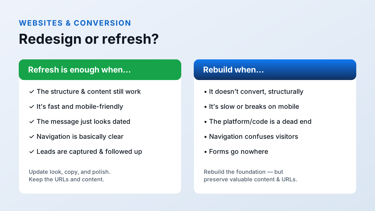
When a site isn’t generating leads, the instinct is to redesign it. Usually that’s the most expensive fix and the least necessary one. A redesign that doesn’t address the underlying leaks just produces a prettier version of the same problem — and resets whatever was working. Diagnose first, then fix in order of impact.
A sensible sequence for most local businesses looks like this:
- Message first. If a visitor can’t tell what you do and who it’s for in a few seconds, nothing else matters. Fix the headline and the value proposition before anything visual.
- The next step. Make the primary call to action obvious and consistent, and remove the competing ones. This is often the single highest-return change on the whole site.
- Speed and mobile. Make sure the pages that matter load fast and hold still on a phone. A fast, plain page beats a gorgeous, slow one every time.
- Trust. Add the real reviews, photos, and specifics that give a stranger a reason to believe you.
- The plumbing. Confirm the form actually reaches a person and that you can see what’s happening. A working funnel with a modest design will out-earn a beautiful one that leaks.
- Then polish. Once the fundamentals convert, design refinements compound — because now they’re improving something that already works.
The theme is the same one that runs through everything we do: understand the real problem before you build the expensive solution.
Why it all has to work together
Design, conversion, SEO, AEO, and follow-up aren’t separate projects to buy one at a time. They’re one system: search and AI answers bring the right visitor, the page earns the click and the trust, the form captures the intent, and the follow-up closes the loop. A weak link anywhere quietly wastes the strength everywhere else.
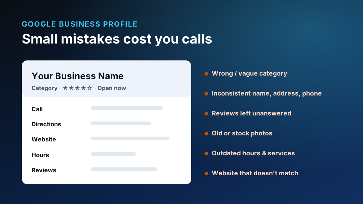
That’s the approach behind our managed websites — built and maintained as an ongoing system, not a one-time deliverable — and behind everything Searchooli does (more on our approach). If you also manage a storefront, don’t miss the Google Business Profile mistakes that cost local businesses calls, or browse more in Websites & Conversion.
The honest bottom line
A pretty website is a good start, not a finish line. If yours looks great but stays quiet, the problem almost certainly isn’t the design — it’s one of the fundamentals above. Fix the weakest link, make sure every lead reaches a real person, and a good-looking site finally starts doing its real job.